typefaces

ttubogi
LIGHT/REGULAR/BOLD 2021
Ttubogi constantly walks in search of unknown emotions. Many people follow and ask Ttubogi why she is walking. Ttubogi answers in her own language, but they don't understand and eventually, Ttubogi walks her way alone. At this time, the traces left on the path where Ttubogi passed are gathered and an explosion occurs. Numerous emotions mixd and explored. The explosion creates a large hole, and her monologue conversation is transmitted through the hole as she fills in her voice. Ttubogi's feelings, which she felt emptiness, reach fullness in the end.


croissant
thin/regular/bold 2021
Me, never thought I would make a typeface of croissant. It is emotional. It speaks both to our minds and intellect because shapes materialize ideas and stimulate our emotions through their visual characteristics. The layers of croissant layers were baked together to form a typeface.


fruity hybtid 2020
Inspired by fruit sticker collection

recto
LIGHT/REGULAR/BOLD
2020
Recto is a french word, which means the front of something. Typeface'Recto' is extremely hard to use because of its dominating character.

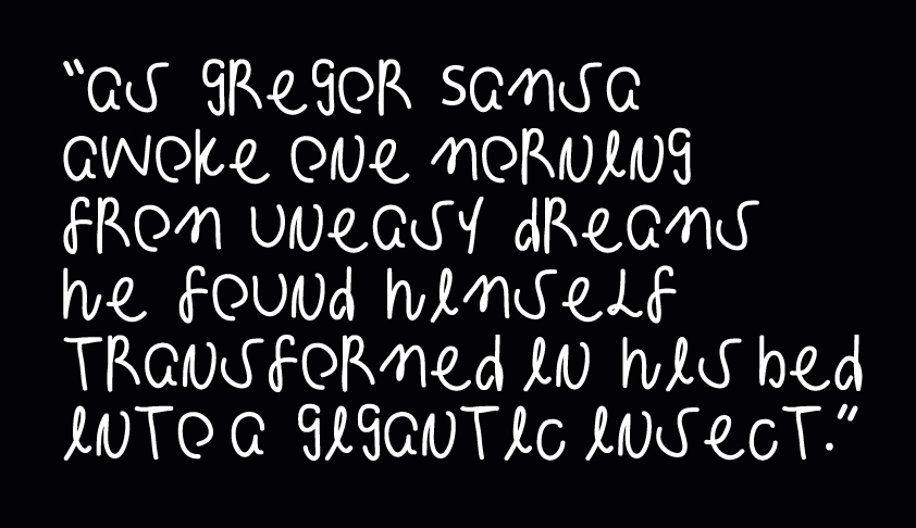
kafka, gregor 2020
“As Gregor Samsa awoke one morning from uneasy dreams he found himself transformed in his bed into a gigantic insect.”
The Metamorphosis is a novel written by Franz Kafka. From my interpretation point of view, it was a story about the psychological distance between Gregor and his family, and the process of human alienation. I tried to visualize the multifaceted expression of emotion into letterforms.
Kafka uses a square grid to express the separation. Gregor is a more emotional typeface. Handwritten and crumpled forms indicate Gregor's anxious feeling.
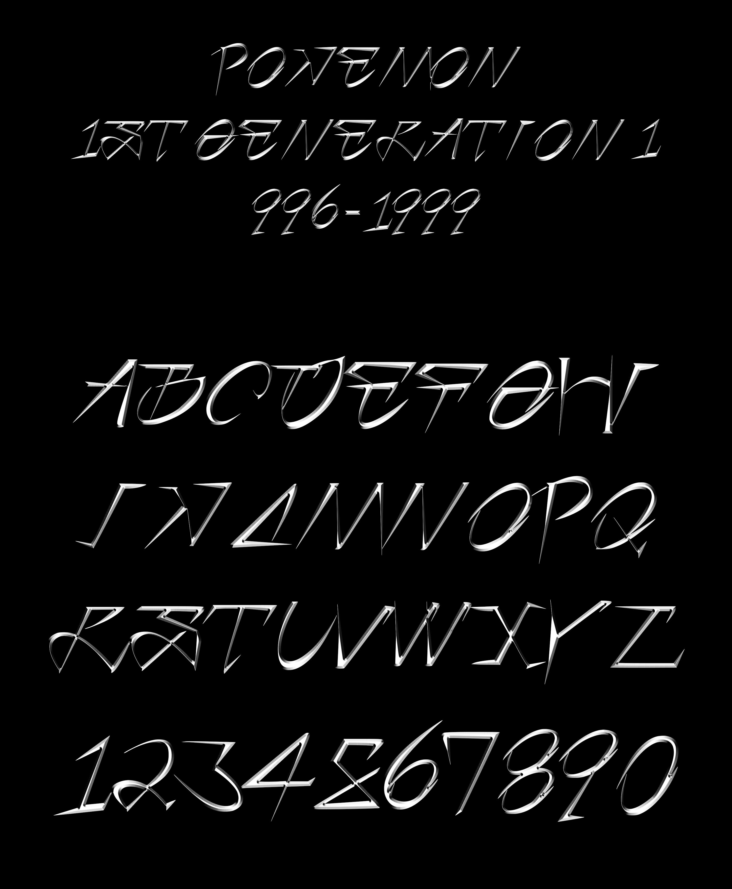

pokemon serif 2019
Pokemon Serif is inspired by the aesthetics of Pokemon cards. It features a strong serif, which shows the futuristic feel and speed inherent in Pokemon cards.
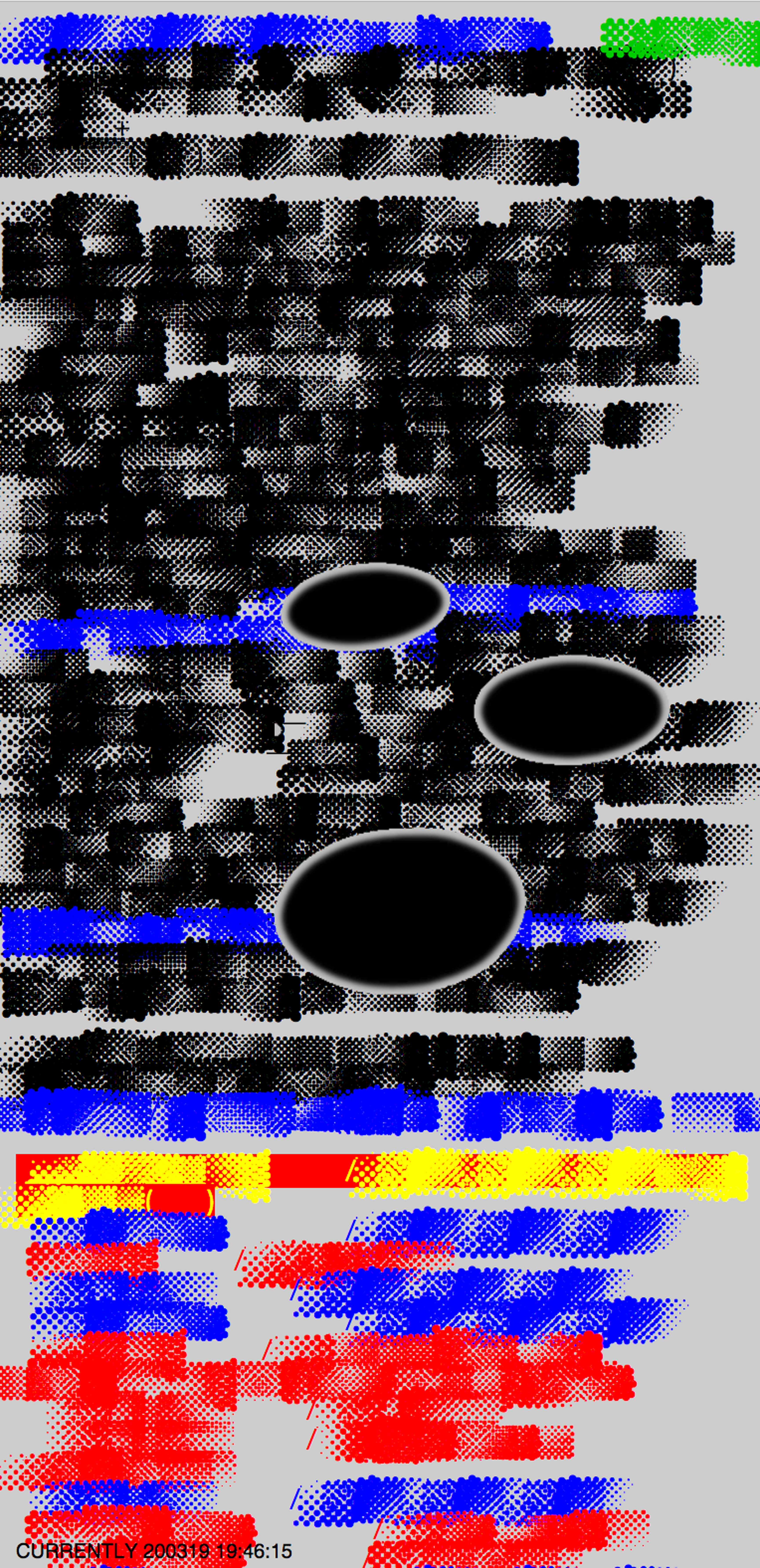
dotdotdot
REGULAR/ ITALIC 2019
A halftone dot is a copying technique or dot that uses dots to follow the image of continuous color according to size or emotion, and it shows a gradient-like effect. DOTDOTDOT is a typeface created using the dotted dot effect, and shows various gradient combinations whenever a word or sentence is struck.


global groove 2018
Inspired by NamJune Paik’s video work Global Groove, 1973>. A work of video dance expressing the words in the video as a body movement. He showed that it is feasible to connect white and black people, eastern and western, younger and old generations through non-verbal communication medium.
From this perspective, in Global Groove typeface, non-verbal body movement turned into the letterform. It is characterized in that body movement is expressed as a combination of simplified modeling.


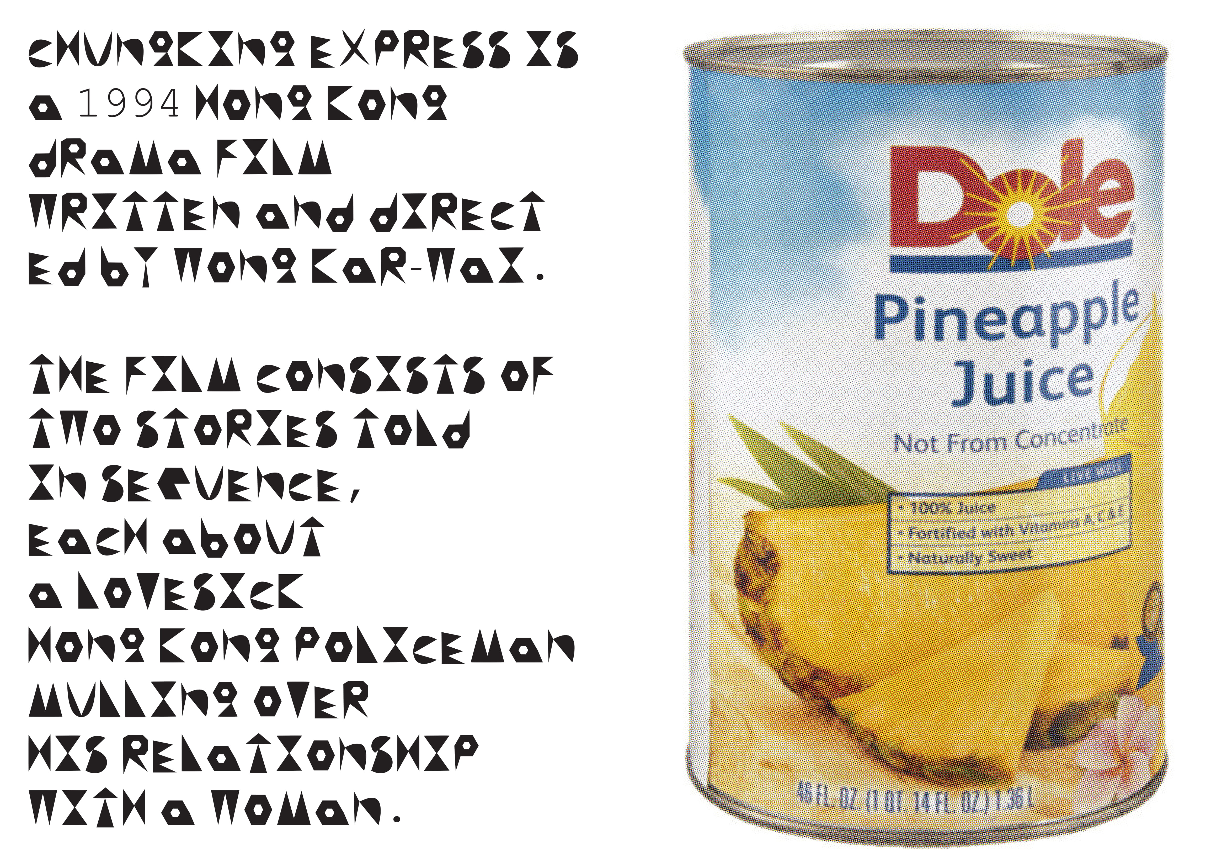
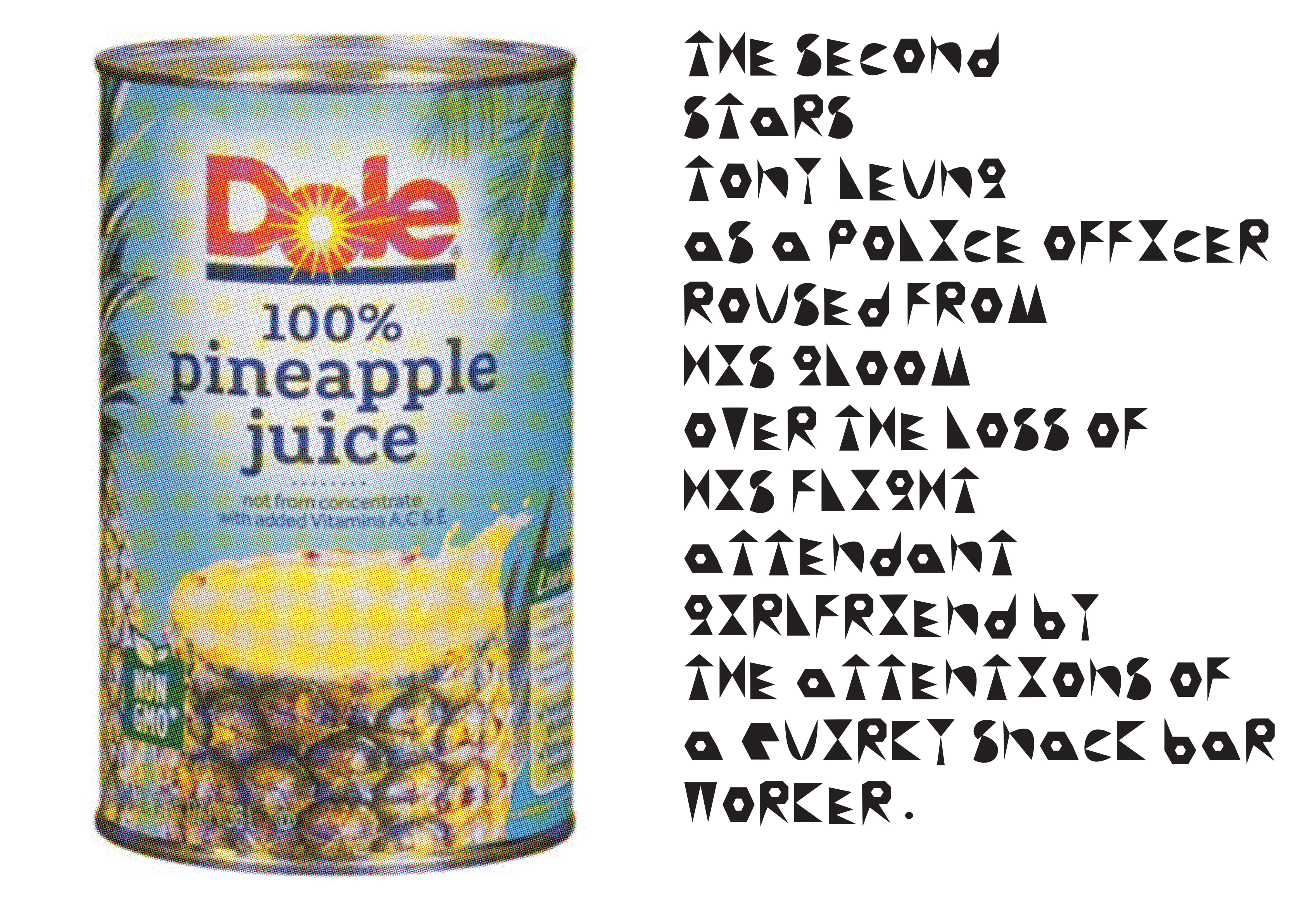
pineapple can
regular 2018
PineappleCan Regular is based on movie Chungking express. This film is about love story. Associate the eternal feeling of love with the expiration date to show the end of love. The means to remember her is the number and pineapple can.
The shape of the bitmap number written on the pineapple can and the material feel of the pineapple can were designed in the outline shape of the letters.